
Family Law Attorney Website Design: What Divorcing Clients Look For in the First 10 Seconds
TL;DR
- Family law attorney website design must reduce emotional stress quickly
- First 10 seconds decide engagement or exit
- Clear messaging builds immediate trust
- Layout guides hesitant users
- Emotional tone influences decisions
- Mobile experience impacts engagement
- Strong design turns visits into consultations
Introduction
Most family law websites lose clients before they even begin reading.
Not because of poor services, but because of poor first impressions.
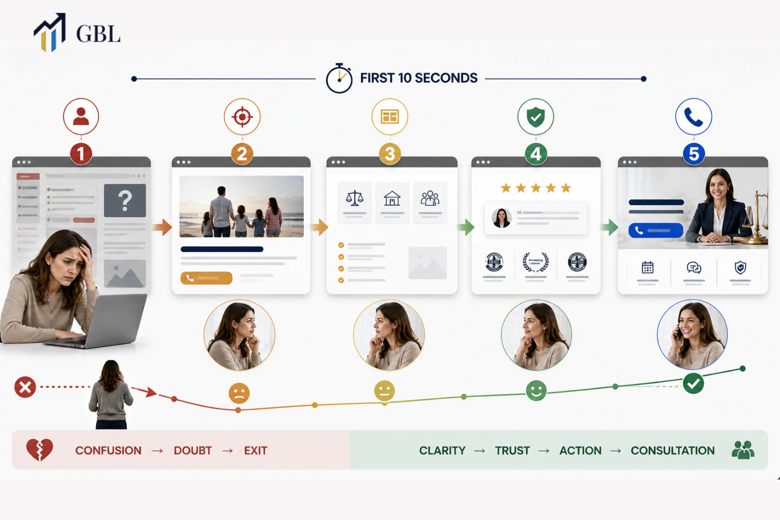
In family law attorney website design, the first 10 seconds are critical. Users are not browsing casually. They are dealing with emotional stress, uncertainty, and life-changing decisions. If your website does not immediately make them feel understood and supported, they leave. A strong design does not just present information. It reduces hesitation, builds trust, and guides users toward action.
How the First 10 Seconds Decide Whether Users Stay or Leave
The first 10 seconds are where users decide if your website is relevant.
Clarity determines engagement.
When someone searching for a divorce lawyer lands on your site, they are looking for reassurance and direction. If your message is unclear or overwhelming, they leave quickly. This increases bounce rates and reduces conversions.
A clear and focused design helps users understand your services instantly. It removes confusion and creates a sense of control.
Real Law Firm Example
One firm has a generic homepage with unclear messaging. Users leave quickly.
Another firm clearly communicates its services at first glance. Users stay longer and engage.
Key Points
- First impressions are immediate
- Clarity improves engagement
- Confusion increases exits
- Strong messaging retains users
This is where most firms lose potential clients.
What Divorcing Clients Need to See Immediately on Your Website
Divorcing clients are not browsing your website casually. They arrive with stress, uncertainty, and a strong need for clarity. In family law attorney website design, the first few seconds must answer their most important question: “Can this firm help me with my situation?” They will depart and keep looking for someone who feels more connected and encouraging if that response is not immediately apparent.
What these users are looking for is not complexity or detailed legal explanations. They want reassurance. They want to feel understood. Clear service descriptions help them quickly recognize that you handle cases like theirs. When your messaging speaks directly to common situations such as divorce, custody, or support, it creates immediate relevance. This reduces confusion and helps users feel that they are in the right place.
Supportive messaging is equally important. The tone of your content should make users feel comfortable, not overwhelmed. Simple language, clear explanations, and a calm tone help reduce emotional pressure. At the same time, visible next steps, such as clear calls-to-action, guide users toward contacting your firm. When users know exactly what to do next, they are more likely to take action.
Real Law Firm Example
One firm uses vague messaging that does not clearly explain its services. Users land on the site but are unsure if it applies to their situation, so they leave quickly.
Another firm clearly outlines its services and speaks directly to divorcing clients. The messaging is simple, supportive, and easy to understand. Users immediately recognize that the firm can help them, which leads to longer engagement and more consultations.
Key Points
- Clear service explanations create immediate relevance
- Supportive messaging reduces emotional stress
- Visible next steps guide users toward action
- Simple language improves understanding
- Relevance increases engagement and trust
This is where trust begins. Most law firms focus on presenting information instead of addressing user needs. When your website quickly shows that you understand the client’s situation and can help them move forward, it creates a strong foundation for engagement and conversion.
How Emotional Messaging Builds Immediate Connection
Family law clients do not approach your website in a neutral state of mind. They are often dealing with stress, uncertainty, and personal challenges that affect how they think and make decisions. In family law attorney website design, this emotional context is critical. Users are not just evaluating legal expertise. They are looking for someone who understands their situation and can guide them through it.
This is why messaging must go beyond facts and focus on emotional clarity. When users read your website, they should feel that their concerns are recognized. If your tone is too formal, technical, or distant, it creates a barrier. Instead of feeling supported, users may feel judged or overwhelmed. This increases hesitation and reduces the chances of them reaching out to your firm.
A supportive tone changes this experience. Simple and empathetic language helps users feel more comfortable and reduces emotional pressure. It creates a sense of trust, which is essential in family law cases. When users feel understood, they are more likely to stay on your website, explore your services, and take the next step. Emotional messaging is not about being overly expressive. It is about being clear, calm, and relatable.
Real Law Firm Example
One law firm uses complex legal jargon throughout its website. While the information is accurate, it feels distant and difficult to connect with. Users visit the site but leave quickly because they do not feel understood.
Another firm uses empathetic language that speaks directly to the user’s situation. The tone is simple, supportive, and easy to follow. Users feel more comfortable and stay longer on the site. This leads to higher engagement and more inquiries.
Key Points
- Emotional clarity builds trust and comfort
- Tone directly influences user decisions
- Supportive messaging reduces stress
- Simple language improves connection
- Emotional alignment increases engagement
This is where relationships begin. Most law firms focus only on explaining their services, but clients are making emotional decisions. When your messaging reflects understanding and support, it creates a connection that moves users from hesitation to action.
How Layout Structure Reduces Confusion and Guides Users
Layout controls how users move through your site.
Structure reduces friction.
A well-structured layout organizes information clearly and guides users step by step. This is especially important in family law, where users may feel overwhelmed.
Simple and logical design helps users find what they need quickly and keeps them engaged.
Real Law Firm Example
One firm has a cluttered layout. Another uses structured sections. The second firm performs better.
Key Points
- Clear sections improve navigation
- Logical flow reduces confusion
- Structure guides users
- Simplicity improves usability
To improve layout, review strategies used in law firm mobile website design.
Most firms design without structure.
Why Trust Signals Are Critical in the First 10 Seconds
Trust determines whether users take action.
It must be built instantly.
Trust signals such as reviews, testimonials, and credentials provide proof that your firm is reliable. Without them, users may hesitate or continue searching.
Visible trust signals reduce uncertainty and increase confidence.
Real Law Firm Example
One firm lacks trust signals. Another includes reviews and credentials. The second firm generates more inquiries.
Key Points
- Trust reduces hesitation
- Reviews increase credibility
- Credentials show expertise
- Proof builds confidence
This is where decisions are influenced.
How Mobile Experience Impacts Family Law Client Behavior
Most users visit law firm websites on mobile devices.
This changes design priorities.
In law firm mobile website design, the experience must be fast, simple, and easy to use. Buttons should be accessible, and content should be easy to read.
A poor mobile experience leads to higher bounce rates and lost opportunities.
Real Law Firm Example
One firm ignores mobile optimization. Another focuses on mobile. The second firm performs better.
Key Points
- Mobile is the primary device
- Speed affects engagement
- Usability impacts conversions
- Optimization improves results
This is where performance matters.
How Clear Calls-to-Action Turn Visitors Into Consultations
CTAs guide users toward action.
They must be clear and visible.
In family law attorney website design, CTAs should be easy to find and understand. Users should not have to search for how to contact your firm.
Clear CTAs reduce hesitation and encourage immediate action.
Real Law Firm Example
One firm hides CTAs. Another places them clearly. The second firm converts more.
Key Points
- Visible CTAs improve conversions
- Clear messaging drives action
- Easy access reduces friction
- Strong placement increases results
This is where action happens.
Frequently Asked Questions
- Why are the first 10 seconds important?
They determine whether users stay or leave. - What do family law clients look for?
Clarity, trust, and reassurance. - Does emotional messaging matter?
Yes, it influences decisions. - Is mobile optimization necessary?
Yes, most users are on mobile. - What drives conversions?
Clear messaging, trust, and structure.
Conclusion
Family law attorney website design is not just about appearance. It is about understanding how users think and feel in the first 10 seconds. When your website reduces stress, builds trust, and provides clear direction, it becomes a system that turns visitors into clients.
CTA
If your website is not converting visitors into consultations, the problem is often what happens in the first 10 seconds. Most law firms focus on design without understanding how users experience it, which leads to missed opportunities. At GBL, we build websites designed to connect with users immediately, reduce hesitation, and guide them toward action. Instead of relying on a generic design, you get a system built for real results. If you want your website to generate consistent consultations, this is where it starts.