
Law Firm Mobile Website Design: How Thumb-Friendly Navigation Increases After-Hours Consultations
TL;DR
- A law firm mobile website design directly impacts consultations
- Most legal searches happen on mobile, especially after hours
- Thumb-friendly navigation improves usability and engagement
- Poor mobile UX leads to lost leads
- Clear layout and simple actions increase conversions
- Mobile design must focus on speed and clarity
- The right structure turns visitors into consultations
Introduction
Most law firm websites are not designed for how users actually behave.
People search for legal help on their phones, often outside business hours. They are looking for quick answers and immediate action.
But many sites are hard to use on mobile.
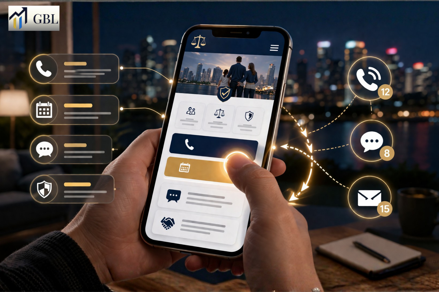
Law firm mobile website design must be built around real user behavior. Visitors are not browsing casually. They are holding their phone in one hand, scrolling quickly, and deciding within seconds. If your navigation is not easy to use with a thumb, or your layout is confusing, they leave. Improving mobile design is not just about usability. It is about increasing after-hours consultations and capturing high-intent leads.
Why Most Legal Searches Happen on Mobile and After Hours
Legal searches often happen when people need help quickly. These moments are rarely planned. Someone may be dealing with an unexpected situation, feeling stressed, or trying to make an important decision late in the day. Because of this, many searches happen outside normal business hours, when law offices are closed. In these situations, users turn to their phones as the fastest and easiest way to find answers.
Mobile becomes the primary device because it is always available. Users are not sitting at a desk or carefully researching options. They are scrolling quickly, looking for clear information, and deciding within seconds which firm to trust. This behavior is driven by urgency. People want immediate reassurance and a simple way to take action, whether that means calling, submitting a form, or saving a contact for later.
This shift in timing and device changes how websites need to perform. If your site is not easy to use on mobile, or if it does not clearly guide users, you lose the opportunity before it even begins. A strong law firm mobile website design ensures that your site works in these high-pressure moments. It makes it easy for users to understand your services and take the next step without delay.
Real Law Firm Example
One firm focuses mainly on desktop design and does not consider after-hours behavior. Their website is difficult to navigate on mobile, and users leave quickly. As a result, they miss out on potential clients who are searching late at night.
Another firm prioritizes mobile experience. Their website is simple, fast, and easy to use on a phone. Even after hours, users can quickly find information and take action. This leads to more inquiries and better engagement.
Key Points
- Many legal searches happen late at night
- Mobile is the primary device for urgent situations
- Users want fast and simple answers
- Quick decisions are made based on ease of use
- Timing and convenience influence conversions
Timing changes everything. When users are searching outside business hours, your website becomes your first point of contact. It must be ready to guide them immediately.
Most law firms do not adapt to this behavior. They design websites for office hours and desktop users, while real clients are searching on mobile devices at night. This gap is where many opportunities are lost.
How Thumb Behavior Impacts User Navigation on Mobile
On mobile devices, users interact with your website using their thumbs. This may seem like a small detail, but it has a major impact on how your site performs. Most users hold their phone in one hand and scroll quickly, making decisions in seconds. If your buttons, menus, or key actions are difficult to reach, the experience becomes frustrating. When this happens, users are more likely to leave your site instead of trying to figure it out.
Thumb-friendly design means placing important elements where users can easily tap without effort. This includes call-to-action buttons, navigation menus, and contact options. If these elements are placed too high, too small, or too close together, users struggle to interact with them. Even a small delay or difficulty can break the flow and reduce engagement. Over time, this friction leads to higher bounce rates and fewer conversions.
A strong law firm mobile website design takes thumb behavior into account from the start. It simplifies navigation, uses clear spacing, and ensures that important actions are easy to access. This creates a smooth experience where users can move through the site naturally. When navigation feels effortless, users stay longer and are more likely to take action.
Real Law Firm Example
One firm uses a layout designed for desktop, where menus are placed at the top and buttons are small. On mobile, users struggle to navigate and leave quickly because the site feels difficult to use.
Another firm designs its site with mobile behavior in mind. Buttons are placed within easy reach, navigation is simple, and actions are clear. Users can quickly find what they need and contact the firm without friction. This leads to better engagement and more inquiries.
Key Points
- Buttons must be easy to reach with one hand
- Navigation should be simple and intuitive
- The layout should support natural thumb movement
- Clear spacing improves usability
- Friction reduces engagement and conversions
Design must match how users actually behave. When your website aligns with natural thumb movement, it becomes easier to use and more effective at converting visitors into clients.
Most law firms ignore this detail. They design for appearance rather than usability, creating unnecessary friction and causing users to leave before taking action.
How Poor Mobile Layout Causes Users to Leave Immediately
A cluttered or confusing mobile layout makes users leave quickly. They cannot find what they need.
This increases bounce rate.
Real Law Firm Example
One firm has crowded pages. Another uses a clean layout. The second firm keeps users longer.
Key Points
- Clutter increases confusion
- Clear sections improve usability
- Simplicity keeps users engaged
- Layout impacts decisions
Layout controls engagement.
Most law firms design for desktop first.
How Clear Calls-to-Action Increase After-Hours Consultations
Mobile users want quick action. If your CTA is not clear, they will not convert.
Simple actions work best.
Real Law Firm Example
A firm hides its contact options. Another uses clear CTAs. The second firm gets more calls.
Key Points
- Clear buttons increase conversions
- Easy contact options matter
- Immediate action improves results
- Simplicity drives engagement
CTAs drive results.
Most law firms overcomplicate this.
How Speed and Performance Affect Mobile Conversions
Mobile users expect fast loading times. Slow websites lead to immediate exits.
Speed is critical.
Real Law Firm Example
A slow site loses traffic. A fast site retains users. The faster site converts more.
Key Points
- Fast load times improve retention
- Slow sites increase bounce
- Performance affects rankings
- Speed impacts user experience
Performance drives outcomes.
Most law firms underestimate speed.
How Mobile Structure Connects UX and SEO
Strong website development for lawyers ensures mobile structure supports both usability and SEO. This improves visibility and engagement.
It creates a complete system.
Real Law Firm Example
A firm has a weak mobile structure. Another builds properly. The second firm ranks higher.
Key Points
- Structure improves navigation
- SEO benefits from mobile optimization
- UX and rankings are connected
- Mobile-first design scales
Structure supports growth.
Most law firms separate UX and SEO.
The GBL Approach to Law Firm Mobile Website Design
At GBL, we focus on performance. Our law firm mobile website design approach ensures usability and conversions.
Everything is structured.
Real Law Firm Example
A firm adopts the GBL system and improves mobile leads.
Key Points
- Thumb-friendly navigation
- Conversion-focused layout
- Clear messaging
- Fast performance
To see how this works, explore our approach here.
This is how mobile becomes a lead engine.
Most law firms never reach this level.
What Results Law Firms Can Expect From Mobile Optimization
When mobile design is optimized, results improve quickly. Users stay longer and take action.
The difference is usability.
Real Law Firm Example
A firm improves mobile UX and increases consultations.
Key Points
- Lower bounce rate
- Higher engagement
- More consultations
- Better user experience
- Increased leads
This is what mobile optimization delivers.
Most law firms miss this opportunity.
FAQs
- Why is mobile design important for law firms?
Most users search on mobile devices. - What is thumb-friendly design?
Design optimized for one-handed use. - Does mobile affect SEO?
Yes, Google prioritizes mobile experience. - Why do users leave mobile sites?
Poor usability and slow speed. - How does mobile increase consultations?
It makes contacting easier and faster.
Conclusion
Law firm mobile website design is no longer optional. It directly affects how users interact with your site and whether they choose to contact your firm. When your website is designed for real mobile behavior, it becomes easier for users to navigate, understand your services, and take action. This is what turns mobile traffic into real consultations.
CTA
If your website is not generating after-hours consultations, the issue is likely your mobile experience. Most law firms design for desktop and overlook how users actually behave on their phones. At GBL, we build mobile-first websites that are designed for real user behavior, making it easy for visitors to navigate, trust your firm, and contact you instantly. Instead of losing leads due to poor usability, you get a system that converts mobile traffic into consistent case inquiries. If you want your website to work at all hours, this is where it starts.