
Web Design for Family Lawyers: Layout and Copy Decisions That Reduce Bounce Rate
TL;DR
- Web design for family lawyer must focus on trust and clarity
- Visitors decide within seconds whether to stay or leave
- Layout and copy must work together to guide users
- Emotional context matters in family law
- Clear messaging reduces confusion and bounce
- Strong structure improves engagement and conversions
- The right design keeps users and turns them into clients
Introduction
Most family law websites struggle with one major problem: visitors leave too quickly.
They land on the site, look around for a few seconds, and then exit without taking action.
The issue is not traffic. It is how the website is built.
Web design for family lawyer websites must be designed for trust, clarity, and emotional connection. Family law clients are often in stressful situations. If your layout and messaging do not immediately make them feel understood and guided, they will leave. Reducing bounce rate is not about design alone. It is about how layout and copy work together to keep users engaged and move them toward contacting your firm.
Why Family Law Websites Have Higher Bounce Rates Than Other Practice Areas
Family law websites often have higher bounce rates because the people visiting them are in a very different state of mind compared to other legal clients. These users are not just looking for information. They are dealing with personal situations like divorce, custody, or family disputes. This means they arrive on your website with stress, uncertainty, and emotional pressure. Because of this, their expectations are higher, and their tolerance for confusion is lower.
If your website does not immediately feel clear, supportive, and relevant, users will leave quickly. They are not willing to spend time trying to understand complicated messaging or searching for answers. Instead, they move on to another firm that feels easier to trust. This makes the first few seconds on your website extremely important. Your layout, tone, and messaging must work together to create a sense of understanding and direction right away.
Family law clients are also more cautious when making decisions. They are not just comparing services. They are looking for someone they can trust during a difficult time. If your content feels generic or disconnected from their situation, it creates doubt. But when your messaging reflects their concerns and provides clear guidance, it builds confidence and encourages them to stay.
Real Law Firm Example
One firm uses standard legal language and general service descriptions. While the information is correct, it feels distant and impersonal. Visitors do not feel understood and leave the site quickly.
Another firm speaks directly to the concerns of family law clients. Their messaging is clear, supportive, and focused on real situations. Visitors feel more comfortable, stay longer on the site, and are more likely to reach out.
Key Points
- Users are emotionally driven and need reassurance
- Trust must be built within seconds
- Messaging must feel personal and relevant
- Clear communication reduces hesitation
- Emotional connection improves engagement
Family law requires a different approach because the user journey is more sensitive and personal. Your website must reflect this reality if you want to keep visitors engaged.
Most law firms ignore this and treat family law like any other practice area. As a result, their websites fail to connect with users, leading to higher bounce rates and missed opportunities for new cases.
How First Impressions in Web Design for Family Lawyer Sites Determine Engagement
Users decide within seconds whether to stay on your site. Your homepage must immediately communicate value and clarity.
If users feel confused, they leave.
Real Law Firm Example
A firm uses vague messaging. Another clearly explains services. The second firm reduces bounce rate.
Key Points
- A clear headline improves engagement
- Immediate clarity builds trust
- Simple navigation helps users
- First impressions affect decisions
First impressions control user behavior.
Most law firms lose users here.
How Layout Structure Guides Users and Reduces Bounce Rate
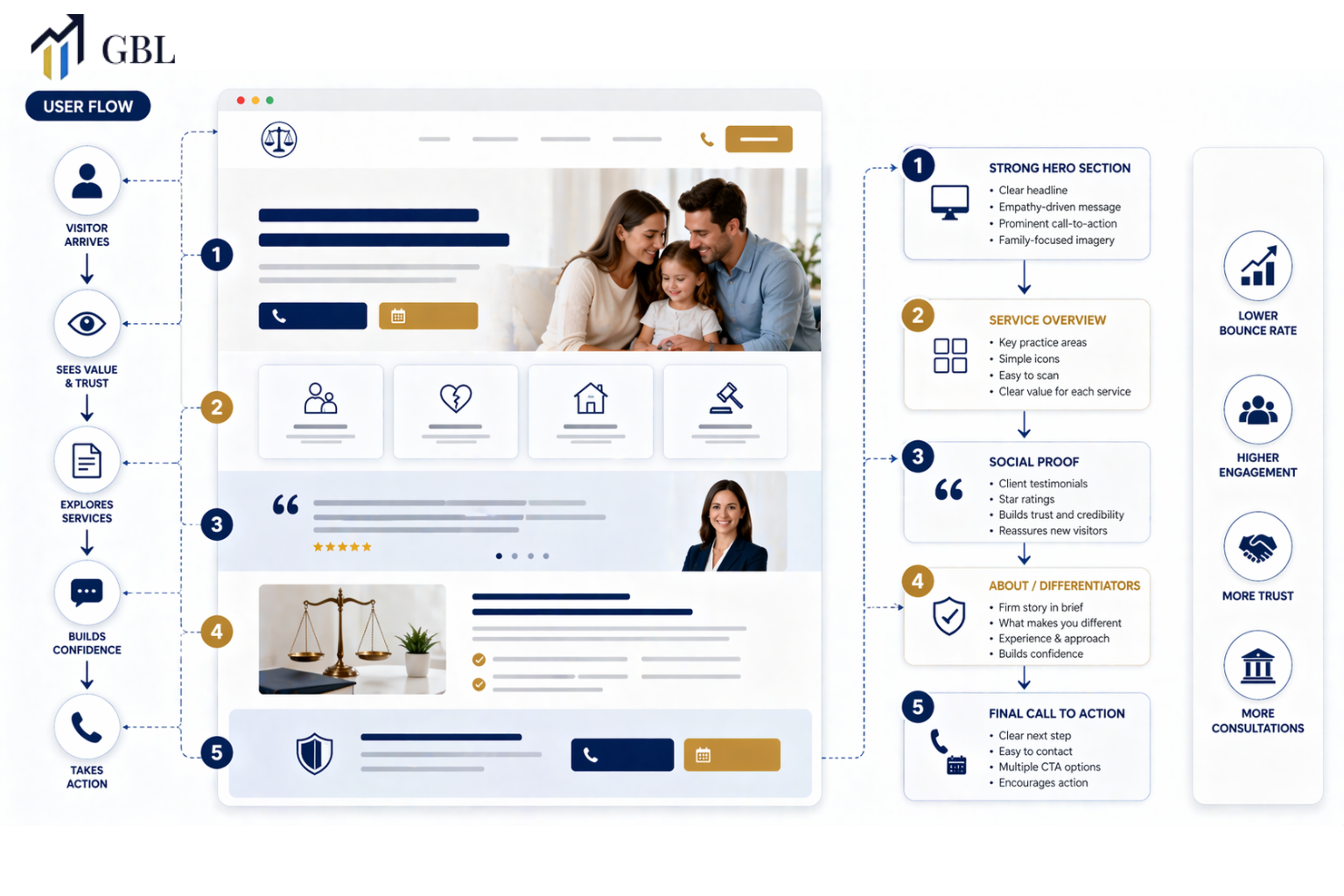
Layout is not just about how your website looks. It controls how users move, what they see first, and how they interact with your content. In web design for family lawyer websites, layout plays a critical role because visitors are often searching for clarity during a stressful time. If your layout feels confusing or overwhelming, users will leave before they understand what you offer.
A strong layout creates a clear path for the user. It breaks your content into simple sections, each with a specific purpose. Headlines introduce the topic, supporting text explains it, and visual spacing makes everything easier to read. This structure allows users to scan while still understanding the message. Instead of feeling lost, they feel guided. This keeps them engaged and encourages them to continue exploring your site.
Visual hierarchy is also important. Not everything on your page should have equal importance. Key messages, calls to action, and service details should stand out clearly. When users know where to look, they spend more time on your site and are more likely to take action. Without this hierarchy, attention becomes scattered, and users lose focus.
Real Law Firm Example
One firm designs its website without a clear structure. Content is crowded, sections are unclear, and users struggle to find important information. As a result, visitors leave quickly, increasing the bounce rate.
Another firm uses a clean and structured layout. Each section is organized, easy to follow, and focused on guiding the user. Visitors can quickly understand services and navigate the site without confusion. This leads to longer session times and more inquiries.
Key Points
- Clear sections improve content flow and readability
- Logical structure reduces confusion and frustration
- Visual hierarchy directs attention to key areas
- Simple layouts make navigation easier
- Organized design keeps users engaged
Layout controls how users experience your website. It turns information into a guided journey instead of a scattered experience.
Most law firms design their websites based on appearance rather than function. They focus on visuals without thinking about how users will move through the page. But without structure, even a well-designed website can fail to keep users engaged and convert them into clients.
How Copywriting Builds Trust and Keeps Visitors Engaged
Copy is what creates a real connection between your website and your potential clients. In web design for family lawyer sites, copy must go beyond explaining services. It needs to understand the emotional state of the visitor and respond to it. Family law clients are often dealing with stress, uncertainty, and personal challenges. If your messaging feels cold, generic, or overly technical, it creates distance instead of trust.
Strong copy makes users feel understood. It speaks directly to their concerns, explains their situation clearly, and shows them that your firm can help. Instead of using complex legal language, effective copy uses simple words that are easy to read and easy to relate to. This clarity reduces confusion and keeps users engaged. When visitors understand what you are saying, they are more likely to stay on your site and continue exploring.
Copy also plays a key role in guiding users. It should answer questions, remove doubts, and lead visitors toward taking the next step. Each section of your website should move the user closer to contacting your firm. Without this guidance, users may read your content but still leave without taking action because they are unsure what to do next.
Real Law Firm Example
One firm uses complex legal terms and formal language throughout its website. While the information is accurate, it feels difficult to understand and lacks emotional connection. Visitors leave quickly because the content does not speak to their situation.
Another firm uses clear, simple language that addresses real concerns. Their copy explains problems in a relatable way and shows how the firm can help. As a result, visitors feel more confident, stay longer on the site, and are more likely to reach out for a consultation.
Key Points
- Simple language builds trust and clarity
- Clear messaging reduces confusion and hesitation
- Addressing real concerns improves engagement
- Solution-focused copy guides user decisions
- Emotional connection increases conversions
Copy keeps users on your site by making them feel understood and supported. It turns information into reassurance and creates a path toward action.
Most law firms write for themselves instead of their clients. They focus on sounding professional instead of being clear and helpful. But in reality, the firms that communicate simply and directly are the ones that build trust faster and convert more visitors into clients.
How Combining Layout and Copy Improves Conversions
Layout and copy must work together. Design attracts attention, but copy drives action.
Without alignment, users leave.
Real Law Firm Example
A firm has good design but weak messaging. Another aligns both. The second firm converts more.
Key Points
- Layout supports messaging
- Copy drives action
- Alignment improves conversions
- User journey becomes clear
This is where performance happens.
Most law firms treat them separately.
How Internal Structure Supports Engagement and SEO
Strong attorney web development ensures that pages are connected and easy to navigate. This improves both SEO and user experience.
It keeps users moving through your site.
Real Law Firm Example
A firm has disconnected pages. Another builds structured links. The second firm improves engagement.
Key Points
- Internal links guide users
- Structure improves SEO
- Navigation keeps users engaged
- Connected pages build authority
Structure supports performance.
Most law firms ignore this.
The GBL Approach to Web Design for Family Lawyer Websites
At GBL, we design websites as systems. Every element is focused on reducing bounce and increasing conversions.
This ensures real results.
Real Law Firm Example
A firm follows the GBL system and improves engagement and leads.
Key Points
- Strategy-first design
- Conversion-focused layout
- Clear messaging
- Structured navigation
To see how this works, explore our web design for family lawyer approach here:
This is how high-performing websites are built.
Most law firms never reach this level.
What Results Law Firms Can Expect From Better Design and Copy
When your website is structured correctly, users stay longer and take action. Bounce rate decreases, and conversions increase.
The difference is clarity.
Real Law Firm Example
A firm improves its layout and copy and sees more inquiries.
Key Points
- Lower bounce rate
- Higher engagement
- Better conversions
- More leads
- Consistent growth
This is what the right design delivers.
Most law firms never achieve this.
Frequently Asked Questions
- Why do users leave family law websites quickly?
Lack of clarity and trust. - What reduces bounce rate?
Clear layout and strong messaging. - Is design or copy more important?
Both must work together. - How fast do users decide?
Within seconds. - What improves conversions?
Clear structure and trust-building content.
Conclusion
Web design for family lawyer websites is not just about appearance. It is about creating a structure that builds trust, guides users, and keeps them engaged. When layout and copy work together, your website becomes a tool that reduces bounce and increases conversions.
CTA
If your website is getting traffic but not generating inquiries, the problem is likely not visibility but performance. Most family law websites fail because they focus on design instead of user experience and conversion strategy. At GBL, we build websites that reduce bounce rate, guide users, and turn visitors into real clients. Instead of guessing what works, you get a structured system designed for results. If you want your website to generate consistent case inquiries, this is where it starts.