
Personal Injury Lawyer Website Design: The Hero Section Elements That Generate Calls
TL;DR
- A personal injury lawyer website design depends heavily on the hero section
- First impressions decide whether users stay or leave
- Clear messaging and trust signals increase calls
- Strong CTAs drive immediate action
- Mobile-friendly design improves engagement
- Emotional clarity builds trust quickly
- The right hero section turns traffic into consultations
Introduction
Most law firm websites lose potential clients within seconds.
Not because of poor services, but because of poor presentation.
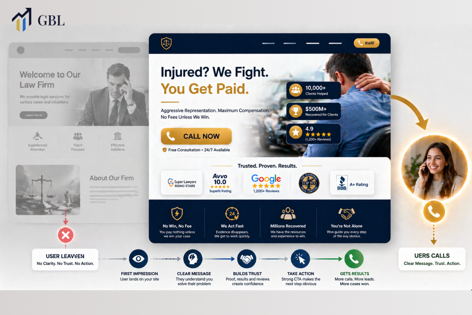
In personal injury lawyer website design, the hero section is the most important part of your entire site. It is the first thing users see, and it decides whether they stay, trust you, and contact your firm. A strong hero section communicates value instantly, reduces hesitation, and guides users toward action. Without it, even a well-designed website can fail to generate calls.
How First Impressions in the Hero Section Impact Call Volume
The hero section is where users decide if your firm is worth their time. This decision happens quickly.
Clarity and relevance matter most.
When someone lands on your site after an accident, they are looking for immediate help. They do not want to search through pages or figure out what you offer. If your hero section does not clearly communicate your service, users leave. This reduces your chances of generating calls, even if the rest of your website is strong.
A strong hero section removes confusion. It tells users exactly what you do, who you help, and why they should trust you. This creates confidence and encourages users to take the next step.
Real Law Firm Example
One firm uses a vague headline and generic messaging. Users do not understand what services are offered and leave quickly.
Another firm clearly states its services and value in the hero section. Users immediately understand and are more likely to call.
Key Points
- First impressions happen instantly
- Clear messaging improves engagement
- Confusion increases bounce rate
- Strong positioning drives action
This is where most firms lose calls.
What a High-Converting Headline Looks Like in Personal Injury Lawyer Website Design
Your headline is the first message users read. It must be clear and direct.
It should focus on the user’s problem.
In personal injury lawyer website design, headlines should address urgency and outcome. Users want to know if you can help them with their situation. A vague or generic headline does not create a connection. A strong headline speaks directly to their problem and positions your firm as the solution.
Clarity is more important than creativity. A simple, direct message performs better than a complex or clever one. Users need to understand your value immediately.
Real Law Firm Example
One firm uses a creative slogan. Another uses a clear, problem-focused headline. The second firm converts more.
Key Points
- Headlines must be clear
- Focus on user problems
- Avoid vague messaging
- Direct language improves conversions
This is where clarity wins.
Why Trust Signals in the Hero Section Increase Calls
Trust is one of the most important factors in personal injury cases. When someone visits your website after an accident, they are not just looking for legal information. They are trying to decide if they can rely on your firm during a stressful situation. This decision happens quickly, and in personal injury lawyer website design, the hero section is where that trust must be established instantly.
Users often compare multiple law firm websites before making a choice. If your hero section does not clearly demonstrate credibility, they may hesitate or move on to another firm. Trust signals help remove this uncertainty. They provide immediate evidence that your firm has experience, success, and a strong reputation. This makes users feel more confident and reduces the perceived risk of contacting you.
Effective trust signals include client reviews, case results, awards, and recognizable affiliations. These elements work because they come from external validation rather than self-promotion. When users see that others have had positive experiences or that your firm has achieved strong outcomes, it builds confidence. This confidence is what encourages them to take the next step and call your firm.
Real Law Firm Example
One law firm has a clean design but does not include any visible trust signals in the hero section. Users see the site but have no clear reason to trust the firm immediately, so they continue searching for other options.
Another firm places reviews, case results, and credentials directly in the hero section. Users instantly see proof of experience and success. This reduces hesitation and increases the likelihood of contacting the firm. As a result, the second firm generates more calls and inquiries.
Key Points
- Trust reduces hesitation and builds confidence
- Reviews provide social proof and credibility
- Case results demonstrate real success
- Credentials establish authority and expertise
- Visible proof increases conversions
This is where decisions are influenced. Most law firms rely only on their messaging and ignore the power of visible trust signals. When trust is established early, users feel more comfortable, stay longer on your site, and are far more likely to take action.
How Call-to-Action Placement Drives Immediate Conversions
Your call-to-action is the point where interest turns into action. It is the step that moves a visitor from reading your website to contacting your firm. In personal injury lawyer website design, this moment is critical because users often arrive with urgency. They want help quickly, and if the next step is not clear or easy to find, they may leave and choose another firm.
CTA placement plays a major role in how users interact with your website. If your call-to-action is hidden, placed too far down the page, or unclear, it creates friction. Users should never have to search for how to contact you. The hero section is the most visible area of your site, which makes it the ideal place for a strong and clear CTA. When users immediately see options like “Call Now” or “Free Consultation,” they are more likely to take action without hesitation.
Clarity is just as important as placement. A strong CTA tells users exactly what will happen next. It reduces uncertainty and makes the decision feel simple. When combined with urgency, such as emphasizing immediate help or quick response times, it encourages users to act faster. This is especially important in personal injury cases, where timing often influences decisions.
Real Law Firm Example
One law firm places its CTA below the fold, requiring users to scroll and search before finding how to contact the firm. Many users leave before reaching that point, resulting in lost opportunities.
Another firm places a clear and visible CTA directly in the hero section. The message is simple, and the action is easy to take. Users immediately understand what to do, which leads to more inquiries and higher conversion rates.
Key Points
- CTAs must be clearly visible above the fold
- Simple messaging improves click-through rates
- Easy access reduces friction
- Urgency encourages faster decisions
- Strong placement increases conversions
This is where action happens. Most law firms underestimate how much CTA placement affects results. Even small improvements in visibility and clarity can lead to significant increases in calls and consultations, turning more visitors into real clients.
Why Mobile Optimization Is Critical for Hero Section Performance
Most users visit law firm websites on mobile devices. This changes how your hero section should be designed.
Mobile usability is essential.
In law firm mobile website design, the hero section must load quickly and display clearly on small screens. Buttons should be easy to tap, and text should be easy to read. Users will quit if your mobile experience is subpar.
Mobile optimization directly impacts call volume. A better experience leads to higher engagement and more conversions.
Real Law Firm Example
One firm ignores mobile optimization. Another design for mobile first. The second firm performs better.
Key Points
- Mobile is the primary device
- Speed impacts engagement
- Usability affects conversions
- Optimization improves results
This is where performance matters.
How Visual Hierarchy Guides Users Toward Calling
Visual hierarchy controls what users see first. It directs attention.
This improves usability.
A strong hierarchy highlights key elements such as headlines, trust signals, and CTAs. Users naturally follow this flow. If everything looks the same, users become confused and disengaged.
Clear hierarchy reduces friction. It makes navigation simple and intuitive.
Real Law Firm Example
One firm has cluttered visuals. Another uses a structured hierarchy. The second firm keeps users engaged.
Key Points
- Hierarchy guides attention
- Clear structure improves flow
- Simplicity reduces confusion
- Design supports usability
This is where engagement improves.
How Emotional Messaging Connects With Injury Victims
Personal injury clients are often stressed and uncertain. Emotional connection matters.
Messaging must reflect this.
In personal injury lawyer website design, tone plays a key role. Users want reassurance and support. If your messaging feels cold or overly technical, it creates distance. A supportive tone builds trust and connection.
Emotion influences decisions. When users feel understood, they are more likely to act.
Real Law Firm Example
One firm uses legal jargon. Another uses empathetic language. The second firm converts more.
Key Points
- Emotional clarity builds trust
- Tone influences decisions
- Reassurance reduces hesitation
- Connection improves engagement
This is where trust is built.
Frequently Asked Questions
- What is a hero section in a law firm website?
It is the first visible section that introduces your services. - Why is it important?
It determines whether users stay or leave. - What should it include?
Headline, trust signals, and CTA. - Does it affect conversions?
Yes, it directly impacts calls and inquiries. - How can I improve it?
Focus on clarity, trust, and usability.
Conclusion
The most crucial area of your website is the hero section. It controls first impressions, builds trust, and drives action. In personal injury lawyer website design, a strong hero section can turn visitors into clients by reducing hesitation and guiding users toward calling your firm.
CTA
If your website is not generating calls, the problem is often your hero section. Most law firms focus on design without understanding how users interact with it, which leads to missed opportunities and lost cases. At GBL, we build websites designed to convert, not just look good. Our approach focuses on structure, messaging, and user behavior to create systems that consistently generate consultations. If you want your website to bring in real cases, this is where it starts.