
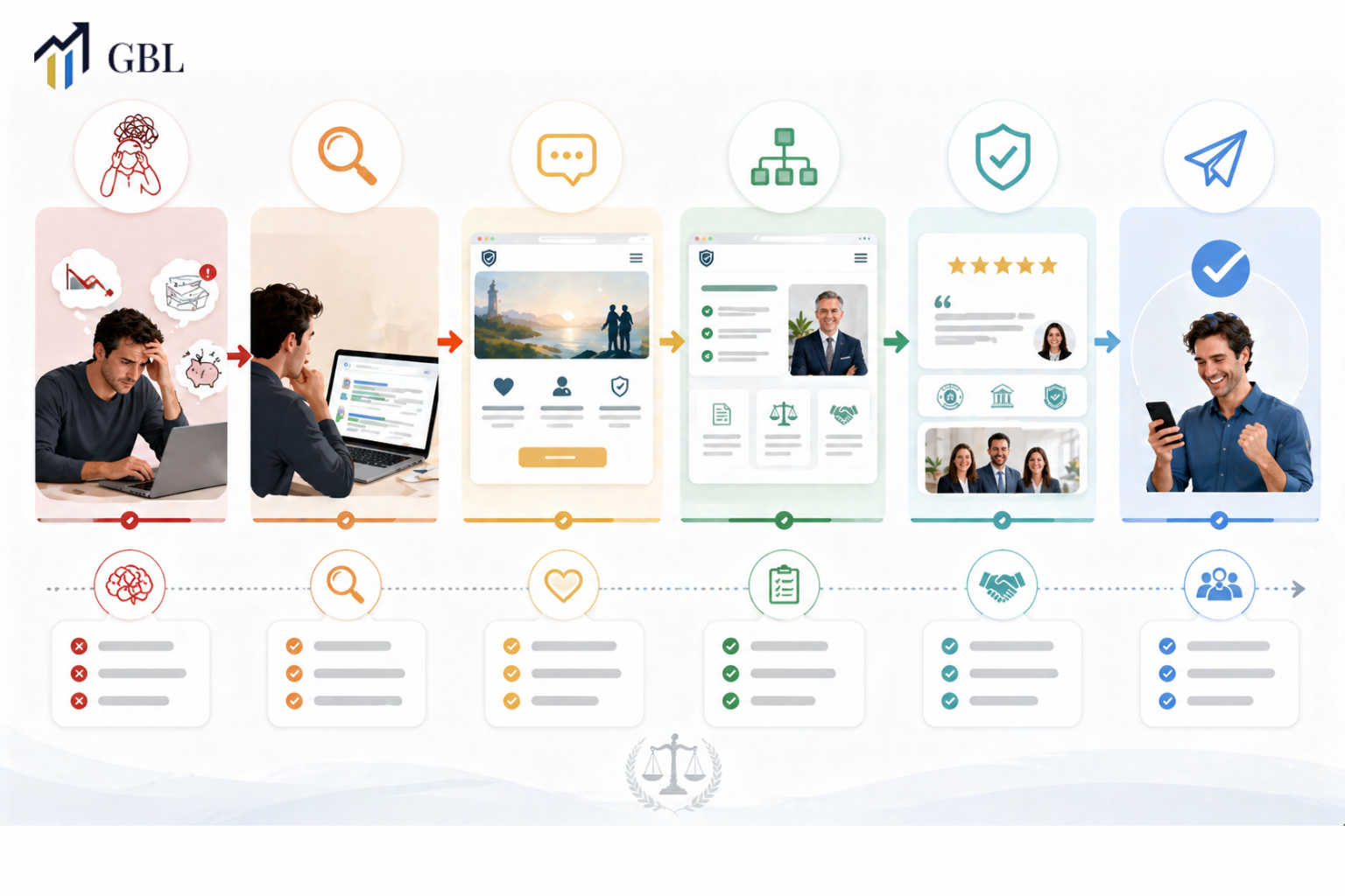
Bankruptcy Lawyer Website Design: How to Reduce Shame and Build Trust Before the First Click
TL;DR
- Bankruptcy lawyer website design must reduce emotional friction
- Shame and fear stop users from contacting lawyers
- Trust must be built before users take action
- Copy and layout influence decisions
- Clarity reduces hesitation
- Mobile experience impacts engagement
- The right design turns hesitation into inquiries
Introduction
Most law firms think their website problem is design.
It is not.
It is psychology.
Bankruptcy lawyer website design is different because your users are not just searching for legal help. They are dealing with stress, fear, and often shame. Before they even click on your website, they are already hesitant. If your website does not address this emotional state, they leave without taking action.
A high-performing website does not just look professional. It reduces anxiety, builds trust, and guides users toward a decision. In bankruptcy law, this matters more than any other practice area.
How Shame and Fear Affect Bankruptcy Client Behavior Online
Bankruptcy clients behave very differently from users in most other legal areas. They are not browsing with confidence or curiosity. Instead, they are often dealing with stress, pressure, and uncertainty about their financial situation. Many feel embarrassed about their circumstances and are hesitant to reach out for help. This emotional state directly impacts how they interact with your website and how quickly they make decisions.
Because of this, users are more cautious and sensitive when visiting a bankruptcy lawyer’s website. They are not just looking for information. They are looking for reassurance. If your website feels too formal, too complex, or too focused on legal jargon, it can increase their anxiety. Instead of feeling supported, they may feel overwhelmed or judged, which causes them to leave without taking action. Even small elements like tone, wording, and layout can influence whether a user stays or exits.
Fear also slows down the decision-making process. Users may visit multiple websites, compare options, and delay contacting a lawyer because they are unsure of what to expect. If your website does not clearly address their concerns or make them feel comfortable, they will continue searching. Building trust early is critical because it helps reduce this hesitation and moves users closer to taking action.
Real Law Firm Example
One law firm uses formal and technical language throughout its website. While the information is accurate, it feels distant and difficult to understand. Users visit the site but leave quickly because they do not feel comfortable or supported.
Another firm takes a different approach. Their messaging is simple, clear, and empathetic. They address common concerns directly and reassuringly explain the process. As a result, users stay longer, engage with the content, and are more likely to contact the firm.
Key Points
- Users feel emotional pressure when searching for help
- Hesitation reduces engagement and interaction
- Fear delays decision-making and contact
- Reassurance increases comfort and trust
- Early trust-building improves conversions
This is where most firms lose clients. They focus on legal accuracy but ignore emotional experience, which creates distance instead of connection. A website that understands user psychology can turn hesitation into action and transform visits into real inquiries.
How Website Messaging Can Reduce Anxiety Before the First Click
Messaging is the first layer of trust your website creates. Before users decide to stay, read, or contact your firm, they quickly scan your headlines, opening lines, and key sections. In bankruptcy lawyer website design, this moment is critical because users are already feeling uncertain and overwhelmed. If your messaging feels complicated, cold, or difficult to understand, it increases anxiety instead of reducing it.
Clear and supportive messaging helps users feel safe. When someone is dealing with financial stress, they are not looking for technical explanations or complex legal terms. They want to know that they are in the right place and that someone understands their situation. Simple language, direct reassurance, and clear explanations help remove confusion. This creates a sense of relief, which makes users more likely to continue exploring your website.
Tone also plays a major role in how your message is received. A harsh or overly formal tone can make users feel judged, while a calm and understanding tone builds connection. Even small changes in wording can make a big difference. When users feel understood, they begin to trust your firm, and that trust is what leads to action.
Real Law Firm Example
One law firm uses complex legal language that focuses on procedures and technical terms. While accurate, the content feels difficult to follow and does not address the user’s emotional state. Visitors leave because they feel overwhelmed.
Another firm uses simple, supportive messaging that explains the process clearly and reassures users that help is available. The tone is calm and understanding, which makes visitors feel more comfortable. As a result, users stay longer and are more likely to contact the firm.
Key Points
- Simple language builds comfort and clarity
- Clear messaging reduces confusion and hesitation
- Reassurance helps users feel safe
- Tone directly influences trust and decisions
- Emotional connection improves engagement
To improve messaging, review strategies used in web design for family lawyer websites, where emotional clarity is also critical.
Most firms ignore tone and focus only on information. But messaging is not just about what you say. It has to do with how you make users feel. When your website reduces anxiety and builds trust from the first interaction, it creates a stronger path toward conversion.
How Layout Structure Guides Hesitant Users Toward Action
Layout is not just about how your website looks. It controls how users move through your site and how easily they can find what they need. In bankruptcy lawyer website design, this is especially important because users are already hesitant and unsure. If your layout is confusing or overwhelming, it increases friction and makes it harder for them to take the next step.
A strong layout creates a clear path for the user. It breaks information into simple sections and guides visitors from one point to the next without effort. Instead of making users think about where to click or what to read, the layout does that work for them. This reduces hesitation and keeps them engaged. When users feel guided rather than lost, they are more likely to continue exploring your site and eventually take action.
Visual hierarchy also plays a key role. Important elements such as headlines, service explanations, and call-to-action buttons should stand out clearly. If everything looks the same, users struggle to understand what matters most. A clean and structured layout helps direct attention and makes the experience feel simple and controlled. This is critical for users who are already feeling overwhelmed.
Real Law Firm Example
One law firm has a cluttered layout with too much text, unclear sections, and no clear flow. Users land on the site but struggle to understand where to go next. As a result, they leave quickly without engaging.
Another firm uses a structured layout with clear sections, simple navigation, and a logical flow. Each section answers a specific question and leads naturally to the next step. Users feel guided through the process, stay longer on the site, and are more likely to contact the firm.
Key Points
- Clear sections improve navigation and readability
- Logical flow reduces hesitation and confusion
- Visual hierarchy guides user attention
- Simplicity improves overall usability
- Structured layout increases engagement
To understand structure better, explore website development for lawyers, where layout and flow are planned strategically.
Most firms design without flow. They focus on appearance instead of user movement, which creates friction and causes potential clients to leave before taking action. A well-structured layout turns your website into a guided experience that leads users from uncertainty to decision.
How Trust Signals Influence Bankruptcy Client Decisions
Trust signals are critical in bankruptcy lawyer website design. Users need proof before they act.
Without it, they hesitate.
Real Law Firm Example
One firm lacks testimonials. Another includes reviews and credentials. The second firm builds trust.
Key Points
- Testimonials build confidence
- Credentials show expertise
- Reviews increase credibility
- Transparency improves trust
Trust drives conversions.
Most firms underestimate this.
Why Mobile Experience Matters for Emotional Decision-Making
Most users search on mobile. This is where decisions begin.
Experience must be smooth.
Real Law Firm Example
One firm has a poor mobile design. Another optimizes for mobile. The second firm converts more.
Key Points
- Mobile-first design is essential
- Fast loading improves engagement
- Clear buttons guide action
- Simple navigation reduces friction
To improve the mobile experience, review the law firm mobile website design.
Most firms are not optimized.
How Local Design Strategy Impacts Bankruptcy Case Intake
Local relevance builds trust. Users prefer nearby firms.
Location matters.
Real Law Firm Example
One firm ignores local SEO. Another builds local relevance. The second firm gains more inquiries.
Key Points
- Local signals improve visibility
- Location builds trust
- Relevance increases clicks
- Strategy improves conversions
For local strategy, see insights from website design Fort Lauderdale.
Most firms overlook this.
The GBL Approach to Bankruptcy Lawyer Website Design
At GBL, we design websites that reduce friction and increase trust.
Everything is intentional.
Real Law Firm Example
A firm follows the GBL system and improves conversions.
Key Points
- Emotion-driven design
- Conversion-focused structure
- SEO integration
- Trust-first approach
To see how we build high-performing sites.
This is how real results are created.
What Law Firms Can Expect From a High-Converting Website
A strong website does more than look good. It drives action.
This is the difference.
Real Law Firm Example
One firm upgrades its design. Another upgrade strategy. The second firm grows.
Key Points
- Better engagement
- Higher conversions
- Increased trust
- More inquiries
- Consistent growth
This is what performance looks like.
FAQs
- Why is bankruptcy lawyer website design different?
Because users are emotional and hesitant. - How do you reduce client hesitation?
Through messaging, structure, and trust signals. - Does design affect conversions?
Yes, it directly impacts user behavior. - Is mobile optimization important?
Yes, most users are mobile. - What matters most, design or strategy?
Strategy defines results.
Conclusion
Bankruptcy lawyer website design is not about visuals. It is about understanding user psychology and building trust before the first click. When your website reduces fear and guides users clearly, it becomes a system that consistently generates cases.
CTA
If your website is not converting visitors into consultations, the issue is not just design. Bankruptcy clients need reassurance, clarity, and trust before they take action, and most websites fail to provide this. At GBL, we build websites that are designed around user psychology, helping reduce hesitation and increase case intake. Instead of relying on a generic design, you get a system built to guide users from uncertainty to action. If you want a website that turns visitors into real clients, this is where it starts.